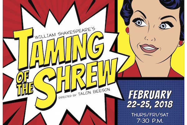
“The Taming of the Shrew” is perhaps one of my favorite Shakespeare plays I have ever experienced, right up there with “Titus Andronicus” and “Julius Caesar.” When I learned APSU’s Theater Department planned a comic book style telling, however, I was curious. How would you turn a live-action play into a style reminiscent of ’50s or ’60s era comic books, a still-image kind of media?
To start, the play presented its prologue as a literal, animated comic book slideshow, complete with live voice-overs of the characters. This was an immediate turn-off. Because the voiceovers were live instead of pre-recorded, the slideshow would go off on its own pace, and the actors would struggle to keep up. This meant it was very difficult to keep track of who was talking and who was not, as the slideshow did not show as much of the dialogue as the actors were reciting. I had to wait for keywords in characters’ speeches via dialogue bubbles in order to determine where we were in the story. It would have made more sense to pre-record the actors’ lines for the prologue and then pay the recorded prologue in its entirety, since normally the actors do a good job in articulating their lines, as seen later in the play.
Thankfully, this artistic approach to a frame story quickly gave way to the main event, complete with colorful actors and vivid scenery. From a character point of view, APSU once again proves its aptitude for drawing in viewers with every sentence.
Petruchio was not afraid to bring his character to life as often as possible, flipping from happy to furious on a dime. Watching him and Kate was truly impressive, the trust they had in each other truly bringing out the worst in their characters. In particular, this manifested in the way they would touch each other. The quick hand movement towards his crotch was a nice touch, bringing out that “This dude is a borderline sexual abuser” vibe for all to see.
From a scenic point of view, all of the sets in the play were actually drawn into large, cardboard versions of “comic books” the cast would open at the beginning of every scene. The art showcased in these comics was pleasant to look at, if not simplistic. Unfortunately, I felt as if the background art style was a bit too distracting. It is a bit difficult to focus on the fact I am watching a man get away with domestic abuse when there were about a dozen square cutouts of a woman dangling from the ceiling.
Because not all of the comic book sets were open at any given time, there was always one of the “closed sets” showcasing their elaborate cover designs that mimic real-life comic books. Again, while the art is stunning and a fine tribute to the genre, it becomes too flashy, too colorful and just distracting. There was too much happening on set at any one time; it became difficult to figure out where my eyes were supposed to focus.
The costumes, however, were much more coordinated. Each character was clearly defined and changes in wardrobe were dramatic and timed perfectly, such as the wedding scene, where Petruchio came in wearing hippie clothing while talking like he was as high as a kite. That was easily my favorite moment of the play, the part when the style truly connected with the story, bringing a new perspective to Shakespeare’s play.
Sadly, I feel the rest of the performance failed to live up to that moment. Too often the art style detracted from the experience rather than enhanced it. Too often did the background distract from the enjoyment I was having at center stage rather than add to it. As the epilogue brought back the awkward slideshow, I could not help but wonder how superior acting was defeated by the disappointing, comic-book style presentation.


